
Start understanding
in full color
Leader in 2024 Gartner® Magic Quadrant™ for Voice of the Customer
Human Experience (HX):
A new era for experience & research technology
Trusted by over 2,500 customers, in over 100 countries

Market research
Get to the top with the world’s number 1 market research technology platform. From sample and panel management, comprehensive surveying, advanced analytics, reporting, to data visualization and more. We’re here to help you deliver compelling research, to any requirement.
Experience
Forsta HX is the ultimate Human Experience platform, to help you enhance customer, employee, patient, and local experience. Improve customer retention, drive revenue growth, and enhance operational efficiencies. Gather, analyze, visualize and act on insights, everywhere.
RETAIL HX
Retail is a human business. Power it with with HX.
Pull customer, employee and brand data together. So you get the full picture on cause, effect, and what happens next. Retail HX from Forsta helps reveal the people behind the data points, so you can sell smarter and perform better.

PG Forsta Named a Leader in the 2024 Gartner® Magic Quadrant™ for Voice of the Customer
PG Forsta Named a Leader in the 2024 Gartner® Magic Quadrant™ for Voice of the Customer PG Forsta recognized by Gartner as a Leader for the 2nd time in a row Chicago and London – February 5th, 2024 – PG Forsta, the leading provider of experience technology, data analytics, and insights that help companies better […]

Cint and Forsta form industry-first partnership to drive a reduction in survey fraud
Cint and Forsta form industry-first partnership to drive a reduction in survey fraud The integration of Forsta technology with Cint’s platform will eradicate nearly all ghost-completed surveys and improve quality CHICAGO – June 1, 2023 – Forsta, a leading global provider of market research, customer experience (CX), and employee experience (EX) technology, today announced a first-of-its-kind partnership with Cint, a global technology leader in digital insights gathering, to fight survey fraud […]

Forsta acquires crowdsourcing and innovation platform HelloIgnite
Forsta acquires crowdsourcing and innovation platform HelloIgnite ‘Companies can simultaneously strengthen CX and EX with Forsta Crowdsourcing, while MR Agencies can engage with consumers in a new way‘ NEW YORK – August 9, 2022 – Forsta, an industry-leading global provider of market research, customer experience (CX), and employee experience (EX) technology, today announced its acquisition […]

Forsta and Rio SEO combine to provide technology solutions spanning the entire customer journey, from discovery to purchase to brand reputation & advocacy
Forsta and Rio SEO combine to provide technology solutions spanning the entire customer journey, from discovery to purchase to brand reputation & advocacy Newly merged business will power Local Experience (LX) solutions that bring together Local Marketing and Customer Experience (CX) technology NEW YORK – July 26, 2022 – Forsta, the global leader in customer experience (CX), employee […]

Make the complex simple
Make the complex simple Surveys with Forsta Plus are easy to create and deploy and deliver engaging respondent experiences. Learn more about our complete end-to-end solution for your survey projects, of any size and complexity. With Forsta Plus, you’ll get– Comprehensive design, deployment and delivery of your survey projects– Reliable management of all reporting requirements– […]

Press Ganey advances technology via acquisition of Forsta, a global leader in Market Research, Customer Experience and Employee Experience
Press Ganey advances technology via acquisition of Forsta,A global leader in Market Research, Customer Experience and Employee Experience Forsta, a Leader in the 2021 Gartner® Magic Quadrant™ for Voice of the Customer, will gain scale and investment to further accelerate product innovation BOSTON AND LONDON (April 27, 2022) — Press Ganey, renowned leader in patient, […]
Take your reporting into the future with Forsta
Take your reporting into the future with Forsta Who is Forsta? How did we get here? And where could you go with us? Our demo of Forsta Visualizations will give you a glimpse of how we can help you deliver reports 40% quicker. From easy-to-use online dashboards to exciting PowerPoints, we’re here to help you […]

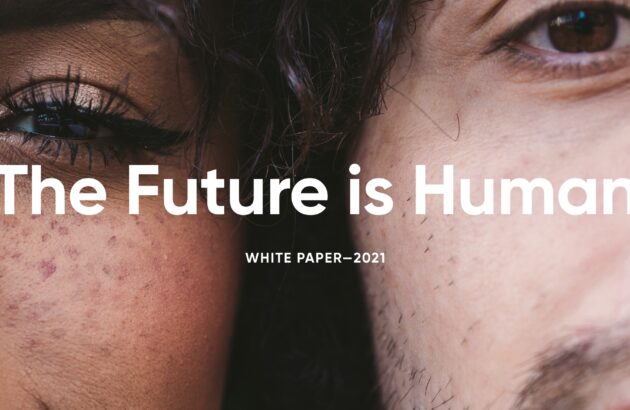
Introducing the future of Experience & Research technology
The future is human The future is human This paper is for anyone leading or drivingCustomer Experience, Insights or Research efforts. Treat me like a human I am not your consumer, your user, your respondent. I am not the sum of my clicks, likes and shares. I am not my purchase history, my demographics, my […]
Giving eBay the human touch
Giving eBay the human touch Tools used We gave eBay a way of combining hard data with face-to-face discussions. So they could relate better to the real people behind their sellers, bidders and buyers. The challenge How do you compete with the might of Amazon as a massive online market place? eBay knew customer experience was the key, but […]

The Forsta HX platform
The most powerful, flexible, connected, and reliable experience & research tech platform. Forsta transcends methodological and data silos. All human experience (HX) is here.
If it’s insightful, it’s measurable. Use customizable surveys to seek insight from any audience – from small teams to global communities. Take the data you need from any touchpoint or channel.
Bring all your data onto a single platform. So you can see the stories behind the statistics. Use advanced analytics tools to search, sort and filter in whatever way gets you to the answers you need.
Put your insights onscreen. Effortlessly. Forsta lets you easily craft all the presentations, reports, infographics and graphs you need. So you can deliver your data as a complete, compelling story.
When the insights are in, make them count. Get the right information to the right people so they can take the right action. Use automation tools to make it instant and effortless.
OUR CUSTOMERS
Trusted by over 2,500 customers,
in over 100 countries.
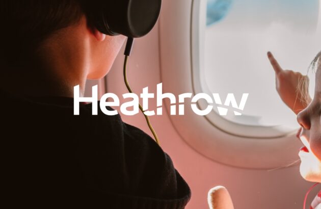
Putting Heathrow on a flight path to discovery
Putting Heathrow on a flight path to discovery Tools used Deck creation Data repository Cross tabulation Infographic dashboards PowerPoint batch reporting Heathrow is Europe’s largest airport. And it collects a lot of information. It interviews 500,000 of the nearly 80 million passengers* who come through its gates every year. Analysing that much data might seem like an impossible […]
Best Buy business success despite the global pandemic
Best Buy business success despite the global pandemic Covid changed so many things in our world beginning in March 2020. Among them, it changed when we could leave our homes, where we went when we did, how we purchased what we needed to live, and how all this was delivered to us. In this webinar, we […]